The 70s Are Back, And So Are Their Colors
What is it about the 1970s that keeps dragging us back? Maybe it’s the wild fashion, or just pure gutsy creativity. But honestly, it might be those colors—deep browns, avocado greens, golden yellows. They turned houses into cozy, lived-in spaces. Everything felt relaxed, warm, and a little bit personal. And right now? People can’t get enough. Those colors are everywhere—runways, living rooms, websites, brand logos. So what’s the deal? Why are we so obsessed again, and how do you use these shades now without your place looking like your grandma’s basement?
Why 70s Colors Feel So Good
The secret sauce? 70s colors are all about earthiness. They ground you. Think:
- Mustard Yellow – bright and creative, but somehow still homey.
- Avocado Green – the classic, calm kitchen vibe.
- Burnt Orange – bold, high-energy, demands attention.
- Chocolate Brown – deep, soothing, keeps things from getting too loud.
- Rust Red and Terracotta – warm, textured, instantly vintage.
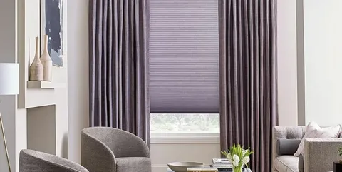
- Mix these up and you get spaces that actually feel welcoming and cool—not just trendy, but with some real character.
Why Designers Keep Coming Back
Designers can’t quit these colors. They’re nostalgic, but they don’t feel like a costume. They’re real. Unlike the neon explosions of the 80s, these are shades you can actually live with. In interiors, a bunch of warm neutrals with a blast of color turns any room into a chill hangout. Fashion? Retro tones are everywhere—corduroy, big prints, you get the idea. Even in branding, these colors tell you, “Hey, we’re real, friendly, and not afraid to stand out.”
Bringing 70s Colors Into Your Life
Want to get in on it? Here’s how:
- Pick a solid base—beige, brown, cream, whatever feels right.
- Throw in a bold accent—burnt orange or mustard yellow will wake up any space.
- Add some texture—wood, rattan, suede. The more tactile, the better.
- Don’t skip the patterns—geometrics, florals, stripes. That’s where the magic (and nostalgia) happens.
- Go-To 70s Color Combos
Try these:
Mustard Yellow + Olive Green + Cream
Burnt Orange + Chocolate Brown + Beige
Terracotta + Ivory + Rust Red
Avocado Green + Mustard + Wood Brown
Perfect for mood boards, digital art, your living room—anywhere you want a little retro kick.
Why the 70s palette still works
This isn’t just a fad. The 70s color palette calebrates creativity comfort and a bit of rebellion.whether you’re decorating or building a brand these Earthy,retro shades always bring some timeless charmThey look back, but still feel fresh—and honestly, who couldn’t use a little more of that?


You May Also Like

10 Small Space Decorating Ideas That Make Any Room Look Bigger
Small Home, Big Upgrade: 12 Smart Space-Savers for 2025